Controversy Over New Zara Logo.
By Claire ConcannonJan. 30 2019, Published 11:42 p.m. ET
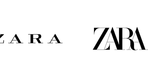
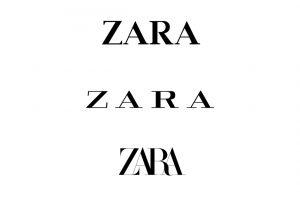
Like it’s previous logo dropped in 2011, the new logo created by Zara consists of the four capitalized letters of the brand’s name in a serif font, however some differences can be seen between the two logos. The older one gave generous space between each letter giving it a more airy and open feel whereas the new logo, launched this week, squashes all of the letters together and according to Fast Company the edges and serifs tangling into one another like they’re struggling to break free. The new font also includes a curve on the “Z” and “R”.

Many people don’t seem to like that lack of minimalism shown in the new logo, which companies such as Google and Uber use. Instead Zara have followed in the footsteps of brands such as Dior and Coach who use a heritage and weightiness in their branding along with heavy, all-cap logos. This may be because designer of the new logo, Baron&Baron, whose founder is Fabien Baron, is known for this type of overlapping space style according to Fast Company. Baron also designed typography for the brands such as Dior and Coach so it’s easy to see the similarities between the brands. It brings the question as to if Zara are trying to stand out among luxury fashion brands.
Some Twitter users showed their dismay towards the new logo, including designer Erik Spikermann who tweeted, “That is the worst piece of type I’ve seen in years. Was this done by one of those new robots that will replace humans?”. Others complained that the letters were too compressed together. On the other hand some people applauded the new design, claiming it was a step forward for the brand, moving away from the generic logos.

However for a company which started in the 1970’s, it seems that Zara may want to stand out with the older, more established brands according to Fast Company.

